Our goal was to move Blueprint toward a Branded House model, ensuring every touchpoint felt like part of one premium experience. Early on, our research showed that while the team was innovative, the brand story felt a bit scattered and the premium experience wasn’t fully landing. We realized that for the brand to actually feel premium, we had to move beyond just good looks and focus on delivering clarity and trust at every stage of the learner's journey.
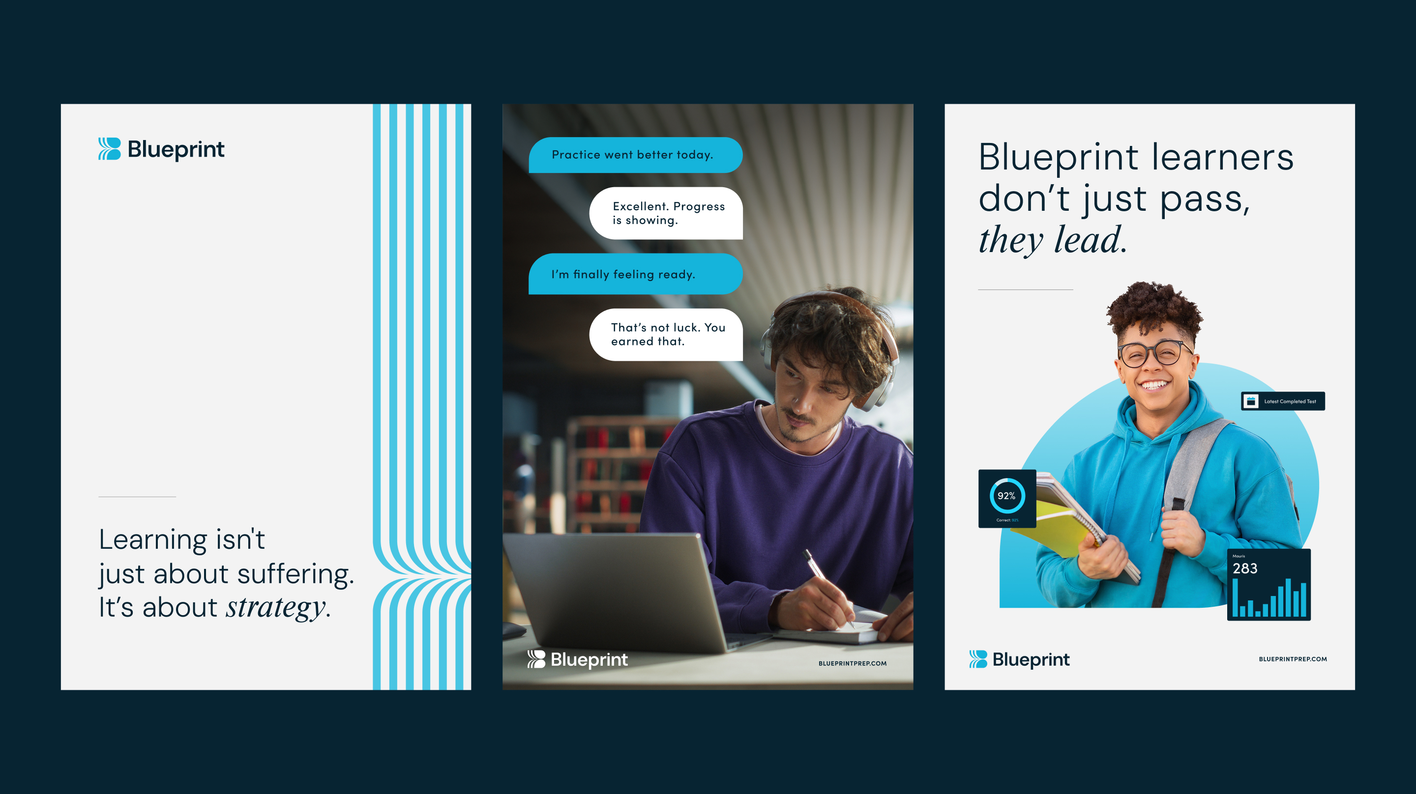
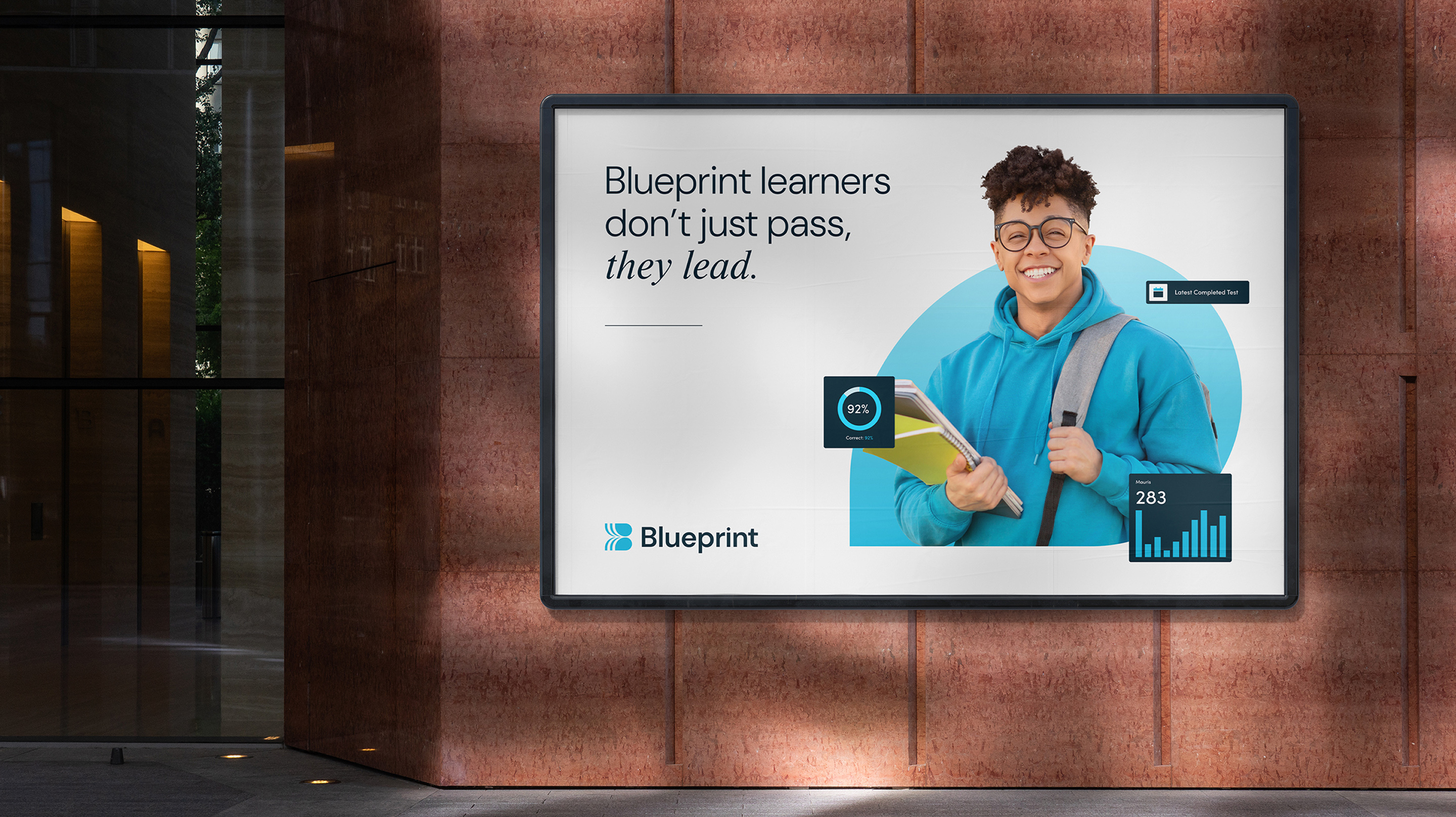
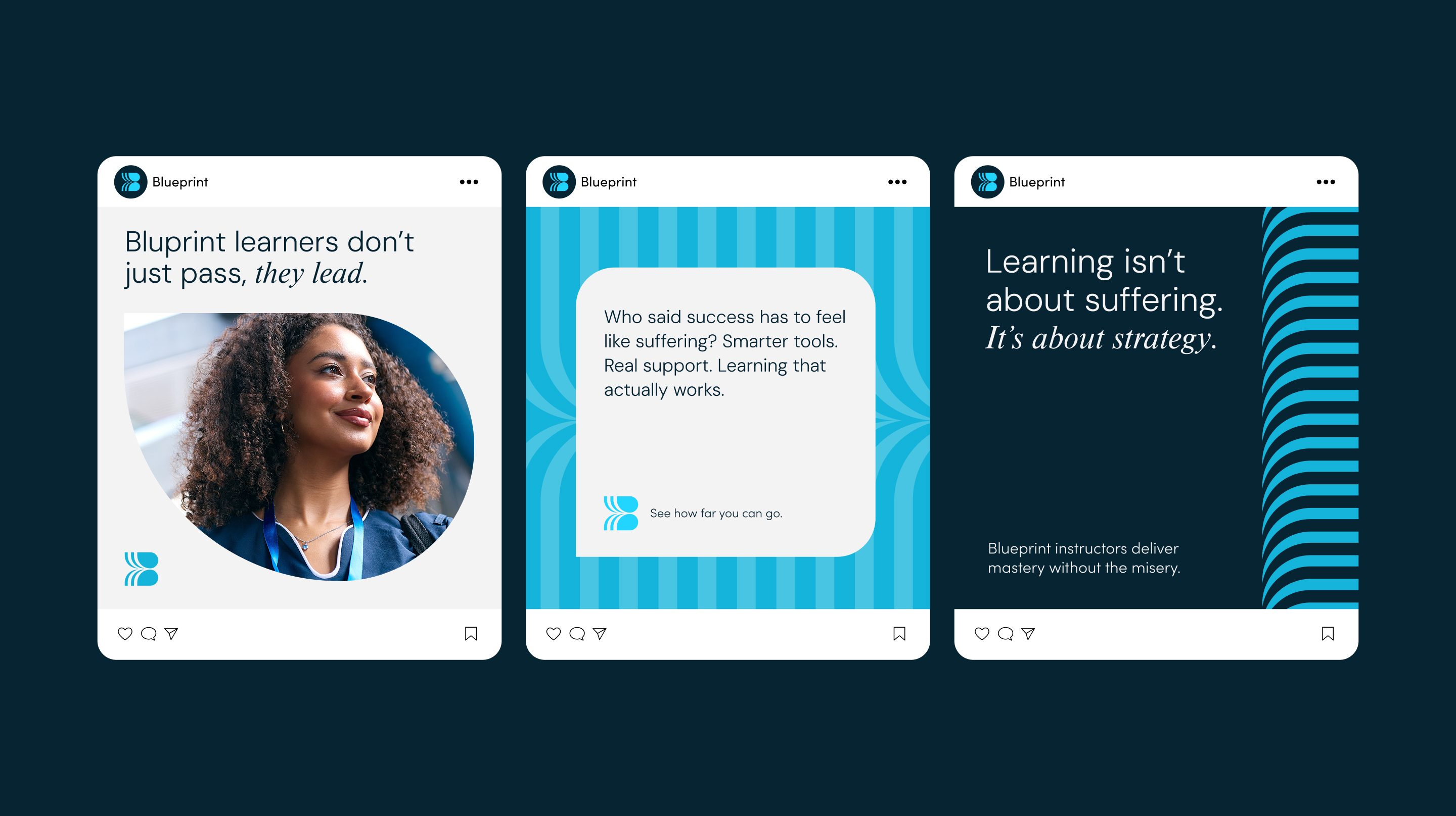
To get there, we had to ditch the old-school idea that high-stakes test prep has to be a medieval trial of suffering. We set our sights on a new “North Star”—essentially, what if Peloton and Noom teamed up to build a human-centered EdTech platform? This shifted the mission from just helping someone pass a single test to becoming a lifelong learning partner that supports people from their first big exam to their career peak.
We leaned into the Creator archetype to keep the personality engaging. Think John Keating in Dead Poets Society—someone who turns a heavy obligation into something genuinely inspiring. Our new voice is Seriously Passionate but Unexpectedly Fun, anchored by a simple rule for all our communications: be bold, be brief, and then get out of the way so the learner can get back to work.
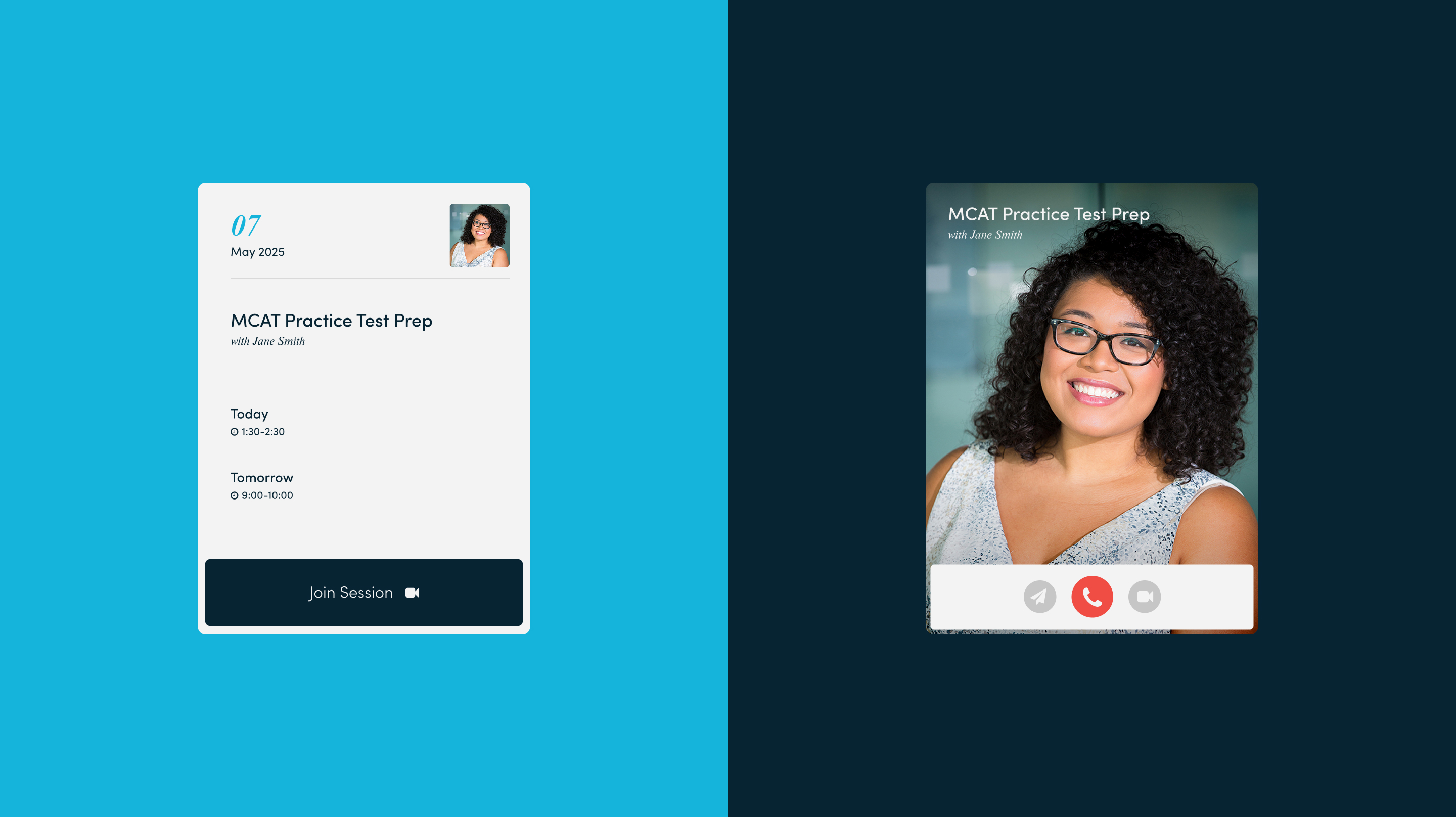
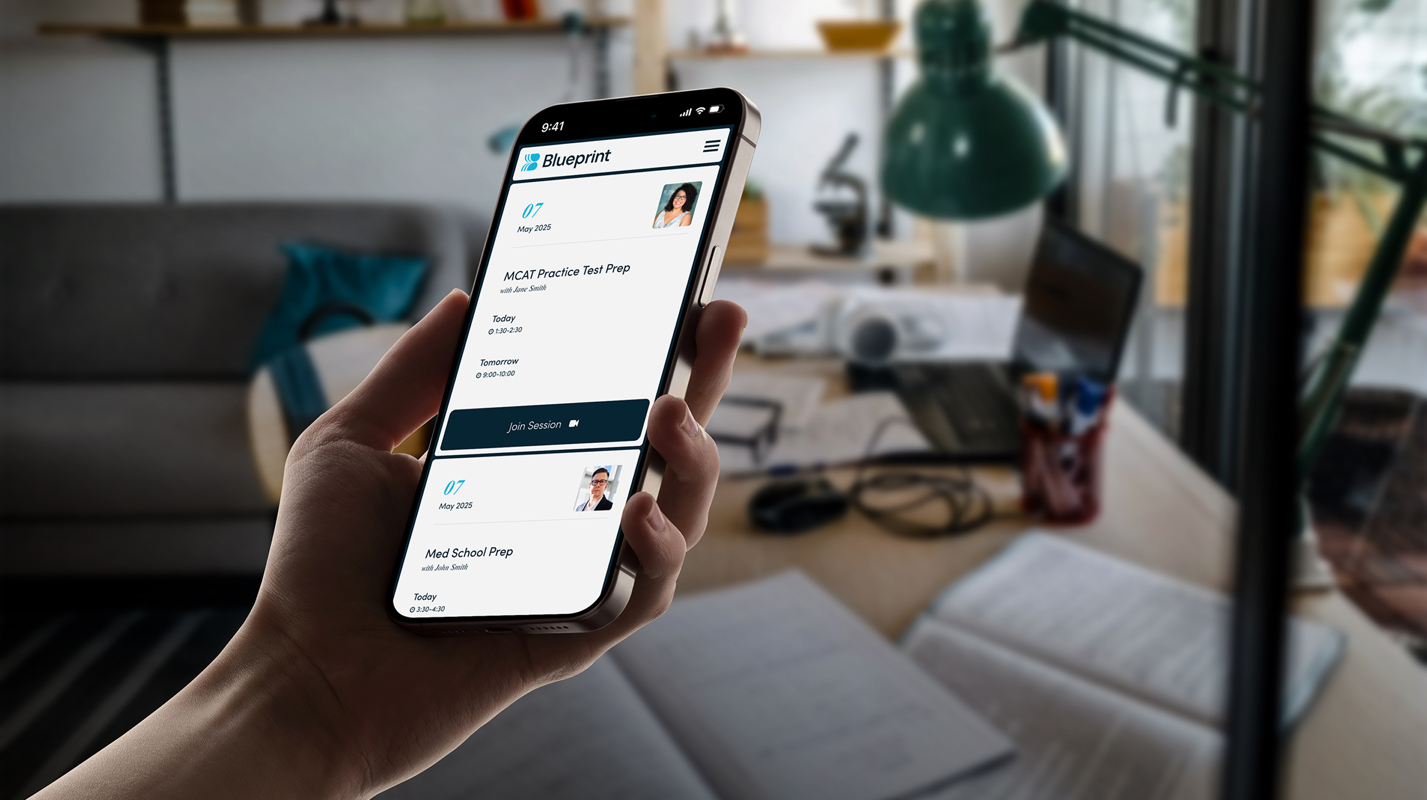
The visual identity was the final piece of the puzzle, with the "Pathway" logo winning out for its premium, dynamic feel. The final mark acts as a compass for the ambitious—its parallel curves representing the learner and guide walking side-by-side toward the thrill of what’s next.
The new Blueprint mark is a compass for the ambitious. Each curve speaks of momentum—not frantic, but purposeful. They are the paths we walk together: learner and guide, side by side. Not just to pass a test, but to embrace the thrill of what’s next. This is Blueprint. This is the way forward.